Telling you a lot about the style of this lecture, as comic sans is a bad typeface, and isn't suitable for a lecture. In a way we are all typographers, therefore should know the basics about it.
There are 6 main classifications, calibri font in power point above, it is the default on a mac, and a standard power point set up, therefore no effort has gone into it.
Gill Sans, better power point, looks more proffessional. Makes people
Adding different things to typography can change the whole look. Simply by adding a box to the heading makes you think trains and signs, therefore its a very powerful tool.
Keep Calm and Carry on. changing the colour of the typeface makes it look different, and gives it a different meaning.
Curlz MT, aweful font, even when in context I wouldn't use this font, it is not a good typeface.
Comic Sans, this is aimed at children, therefore still not in context, and doesn't function well in this context, also very well known as a hated font.
Typography appears in both, as it is verbal, but also visual.
Typography at the intersection of writing, the verbal and visual, consists of all of these things, Meta-communication, Paralinguistics and Kinesics. Its a form of meta- communication because it can change what the words mean, in the way its been visually portrayed. Can effect the speed and rhythm that we read that language. It can be a softer of harder enthesis.
Very loud and in your face, clearly showing a kinesics way of producing type. Sends a different message in the way its saying it, to the message with it says.
Not welcoming massage parlour. Does not work in this context.
This is a rock poster, but portrays a wedding invertaion, it doesn't work in this context.
This slide refers to the film American Physco, talking about business cards, watch the film, good film. Showing that it is important and impacts peoples lives.
Classified into six familys, developed in the 1800's.
Start in modern typography, 1450's, thought to herril the age of print, began then because the Gutenberg's press was invented, allows you to rearrange letters, also mass produce. Prior to that type was reproduced using calligraphy, only certain people could do this, and it was a slow process, nothing happened in this time. The word was now widely available to a mass of people. People started to become educated.
A lot of our alphabet comes from the Romans. Earliest record of letterforms that we recognise as letterforms. We have serifs on the serif fonts because of the Romans, being chisseled into stone.
Almost illedgible, sometimes known as blackletter, very first movable typeface was script.
Reflect handwriting, with a greater elegance, to be much more readable, and to be lighter, this was a move towards legibility. Early attempt to copy human handwriting. Earlier typefaces have a slanted 'e' where as modern is parallel to the baseline. Although it was mechanical they wanted a human element.
He believed that proportions of the alphabet should reflect the perfect human form. Increadible amount of thought that has gone into it.
Adapted fonts to make it more modern but keeping some of the old styles, for example the 'e' slant.
One of the most exciting periods in type history. All of the font produced in this era were called old style, moving away for script and hand written style and move toward a more logic style. This is where type develops and becomes refined.
These are all based on the old styled fonts developed from Venice. Can find these fonts on word and illustrator, and most other programes on a computer.
Get a letter and blow it it, compare with another letter, you can see just how different they really are. Charactorised between thick and thin strokes, designed as the kings font.
Mid 18th century, in Europe. Famous typography called William Caslon, also a developed font.
The difference between this typeface and the William ... typeface is very similar and only has very subtle changes. 'Ultra thinness of the serif will blind the readers' spoken by someone who couldn't tell this typeface an the William one apart.
Starting, development, to modern. A gradual development.
Slightly different, showing the width of the 'M' this is a distinct difference, although people may not know it, they noticed subconciously.
Really important typeface, made by a French typography, the most influential was the Didot.
Hair line thin strokes, and really thick strokes. This is used a look on magazines such as vogue. Didot is used for this, it is seen as elegant, and is appropriate to this magazine. It has been seen as the excepted language of fashion.
Marginally different, but even the subtle differences gives each typeface a different function, and can be used in different ways.
Showing the example of the Didot is use, and it works really well, shows fashion and elegance.
Reference to oriental, as it has been called the egyption, but its doesn't really resemble egyptions. Thick typefaces, known as ugly and brache, quite common in terms of how it is used.
Know as the fat face, slab serif typeface. Hyper-bold style.
This is the font of mass marketing.
Modernist sans serif typefaces, the idea of being international, a typeface for all, modern and progressive.
Eric Gill an amazing designer and has questionable ethics. Gill Sans is available to use in most if not all programes available on a computer.
Aimed to be historic, refernce the Roman empire, the greatness or the British and Roman empire.
Gremanic supiriority, Nazi's used this, which is what its well known for.
Cooper Black invented in the 1920's, seen everywhere.
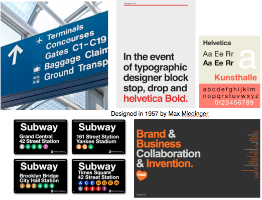
Helvetica bold, anyone can use it and cant go wrong with it. Works well in many different situations as it is so simple and hasn't been pigeon holed in a certain way yet.
Helvetica and Arial - Designed exactly the same, but changed some slight differences, such as the full stop.
Grunge typography, font called bastard, and has been designed to be used by corporate wankers, it is backletter.
Essay about typography.


No comments:
Post a Comment