Greeting Cards.
"Greeting cards help fulfill an enduring need people have to connect with
others. People say there's something special about finding "just the
right card" – one they know will get a reaction from the person who
receives it. They say giving cards is affirming. It feels good to send
them, and it feels good to receive them."
Source
Examples of cards I like;
I decided to start my research by looking through design blogs and websites to find some examples of greeting cards I like.
I found this image on google, I really
like it because of the use of colour, using only one colour with
different opacity's gives more detail to the design without making it
look tacky or overly complicated. The colours used are also appropriate
to the cards use, and the target audience for the cards. These card
could be screen printed or digitally printed, this would work really
well as a screen print, and is something I want to experiment with in
the second year.
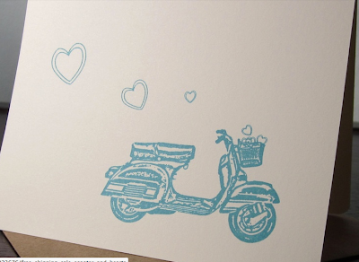
I found one of these images which led me to a website
where there was more versions of the same style cards. I have found
that there is a lot of bikes and vehicles that have been printed onto
cards, I think that they work really well, it is a way to show off the
detail you can get with a screen print. This is what I like so much in
these screen printed greeting cards, the fact that you can see how much
detail has gone into each one, just by using different opacity's of the
same colour.
I went onto a website called
ohsobeautifulpaper, and found that it was full of greeting card designs,
posters, and vouchers. They are all completely different styles but
that is because they are all for different audiences.
These vouchers and greeting cards are aesthetically
pleasing, although they are purely type based cards, I think that they
work really well for what the are used for, and each have specific
target audiences that will enjoy them.
These cards are very different to the others on this
website, they are handmade, and are very simply and effective. The
target audience for these cards are very clear because of the colour of
the bows, together they look like they should be for a congratulations
for a new baby girl or boy, but because there is not type on them, it
can be used for many different occasions.
This image is a really good example of the kind of
design I want to do in my second year, it is simple yet really well
produced. These cards have been screen printed onto two different
stocks, and it looks really effective, this is because of the colours
used. These greeting cards are going to be a big influence on my design
this year as I am wanting to produce some cards that work as well as
these do, also I want to experiment with more screen prints, as it is my
favourite production method.
This is another ood example of what I am wanting to
do in the second year, but not as much for the illustration on the
front, but I like the use of colours on different coloured stocks.
Handmade cards;
I would rather but a card like this, which is simple,
handmade, embossed and with a limited colour palette, it looks a lot
more professional then any card which I found on moonpig and appeals to
me more. Because 80%-85% of card buyers are women I think that this is a
better card, as I think that moonpig cards are mostly bought by men, as
it is the easier option, they can do it from home, and if its late can
say its in the post, also moonpig offers gift packages.
Another thing I found when I was searching for card
designs I like, are that there are a lot of bikes, they are screen
printed onto a good quality stock, and it works really well, a lot of
people are doing this at the moment. Something that makes the cards
better designed is the limited colour palette, as on the personal card
websites they are all very colourful and cluttered.
These cards have been lino cut and hand printed, I
think this makes a difference to the quality of the cards and also the
receiver of the card will know how unique the cards are. I also like the
design of what is on the cards, they are aesthetically pleasing.
This card has been digitally printed, but I think it
works so well because there are only three colours and stock used, the
design is clean and clear. I also think that this could work well as a
screen print.


No comments:
Post a Comment