Oasis Research.
For our collaborative brief, Emily and I decided that we would do the Oasis brief. I decided that it would be good for me too look into Oasis as I don't usually shop there, and don't know a lot about the brand or what they are currently communicating.
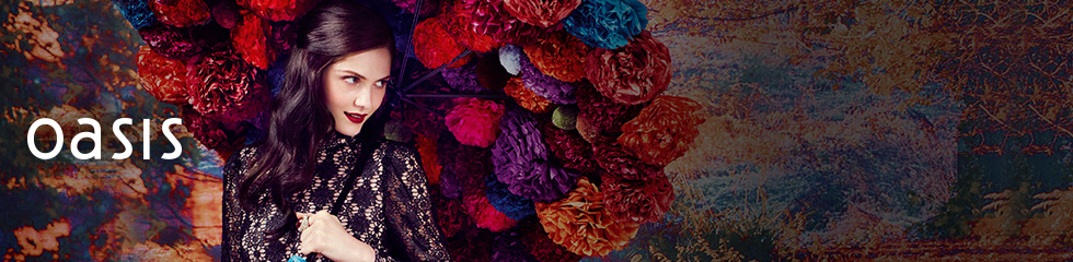
This is the home screen of the website, it is very girly and in your face, I think that the target audience for this is young teenage girls.
Some clothes I found are quite bright and the layout of the website has been designed well.
I found that there are a lot of Oasis stores around the UK and also establishing itself in Europe. This means that the designs produced must be easily read when communicated as it needs to be easily translatable.
Although thinking that the tone of voice and the aesthetic of the website and the store itself, I don't think that the products and clothes available match the target audience.
Oasis state that their target audience are young teenage girls, and they like to have a tone of voice that is very 'chatty and girly' as if they are your best friend. Although in truth the people who actually shop there are young women from the age 23-35. This is something that Oasis is slightly deluded about and will have to bare this in mind when designing the messages for them.
The store inside and out gives an organised yet free look. There are a lot of flowers and colours used in the brand itself, this is something else I will consider when designing.
The campaigns that have already been produced are very colourful with a lot of pinks and blues. This is something I think really suits Oasis and should be considered when designing the new messages for them. Keeping the designs and tone of voice girly and chatty but not too cheesy.
Our Aesthetics.
Emily and I found this piece of design on behance when we were looking for ideas about what we were thinking about doing with the oasis brief.
Looking at the colours used in this design it reminds me of Oasis. We suggested that I should try doing something like this for our illustrations. Keeping the simple shape with a geometric pattern on the inside, although I think that I should try using different opacities rather than different colours in the pattern.
We also saw this which was created by the same person on illustrator which is a similar aesthetic. This is something that we are going to aim for with our design, using vibrant colours with minimal illustrations.


No comments:
Post a Comment