What to Consider when designing for web.
Minimalism in Web Design.
Minimalism is a word that gets tossed around in a
lot of different contexts. Whether it be a lifestyle or an art form,
saying something is "minimalistic" can take on a variety of meanings.
In the web design field, minimalism is carving out an ever-increasing
niche among designers that are looking to convey important content in a
new way. Like just about any trend or theory in the web design world,
minimalism can be easy to get wrong.
Source
Negative Space in Web Design.
Varying amounts of negative space acts as a subconscious visual
guide, giving us important feedback on what items on the screen are the
most important.
Simply put: The more an item stands alone, the more attention it is going to get.
Additionally, negative space is used to group similar bits of
information together which helps to solidify the structure of a design.
The empty space between these information groups gives our eyes and
brains a needed break from information. As a designer, it’s easy to want
to fill this space with graphics and pretty doodads to look at, but
acting on these urges will quickly result in a cluttered and
disorganized design.
Source
Layout Structure.
Having a minimal design does not always imply a simple site
structure. Oftentimes, dialing back the visual overload of a site means
turning up the effort put into an intelligent layout.
Not many things can destroy the effectiveness of a minimal web design quite like a poorly thought out site structure.
Is your logo in a relevant location? Is your site navigation easy to
find and convenient to use? These are huge questions that will make or
break the functionality of your site without over-the-top graphics to
back these important elements up.
Source
Examples of different websites and navigation.
What I like about this website design is the simple structure and grid system to display this design studio, which shows a reflection of the studio itself, to the point with no unnecessary information. Although the navigation on the website is in each of the corners of the page, this is something that I don't really like about this web design, although its consistent throughout the site, I think it makes the website too fiddly, as the link buttons are too close the image links.
Aesthetically this website is a perfect example of how to use simple vector forms to create a website, although the website has no links it is simply scrolling through the whole website. This could work well with anchor point so that you could skip to a certain part, but there are no clear anchor points to help with navigation. The use of only scrolling is often very appropriate for the audience and information, although this website is full of information, therefore it is very tedious to manage.
This website is very minimal using only neutral colours and simple navigation to get around the website, using just a scroll with each image being a link to their page on more information and images. This is something I want to do with my website, use only scrolling up and down, as I don't want it to be too complicated to navigate for my audience, also showing and image, and making it the link to more information about the image, or product.
Minimal web designs are strategically stripped of excess features and
gimmicks in order to deliver a clear and concise message to the target
audience. This is exactly what this website does, it shows you only what it wants you to see, very aesthetically pleasing. The colour scheme that is used on the website if also very appropriate, this is a good example of the impact I want to make with my website, simple with minimal colours and illustrations yet very effective.
The layout of this website would work really well as a homepage for my website, as I have four main pages, Christmas, Birthdays, Valentines Day, and Do It Youself, this means I could fit one in each of the boxes, using simple illustrations to demonstrate what the page will be about or entail. The colours compliment each other well, which is also something I wish to do.
This navigation is something I have never seen before, and really appreciate, although I couldn't use it for my website as it would be inappropriate for my topic and audience, but something I would consider looking into for the future. As the website scrolls down, the website is assembled, each part of the site comes from the bottom corners into place, this is original and something that works really well on this site.
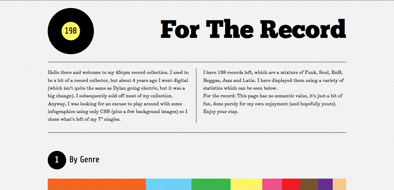
For The Record is a website displaying information about music form different countries and genres etc. It does this through information graphics, and a lot of negative space, this works really well for this topic. Pure information using only different shapes and colours communicates its message well, this is also something I want to do, have a minimal website with only information that is needed, not cluttered with irrelevant stuff.
In order to properly execute minimalism in your design, a focus needs to
be established. Being able to present a clear message to your visitors
is the core function of a minimal design. This website design focuses on three main disciplines of Ed Nacional, Branding and Identity, Illustration, and Lettering. In each discipline area the mouse icon changes as you scroll over it, which makes you want to click, which then takes you to the next example of 'Illustration' for example, this is minimal and it works really well.


No comments:
Post a Comment