Monday 30 December 2013

100 - Branding and Identity

Branding and Identity.
As I am creating a brand for my stationery shop, I want to look at branding and how it effects people and the way they see a brand.
Source
This brand is definitely targeted towards men, it has a very basic colour palette, using only black and stock. Although I find this design a very high quality considering its production was probably relatively cheap, but this shows if a brand is designed well, it can look quality and clean.
Source
La Charcuterie is something quite unique, I have never seen anything like this before, I think this is one of the reasons why it is so effective. Using meat such as salami as they background behind their logo is really clever as it is the kind of thing that stays with you, as it is different and weird in a way. Although the colour might not be consistent they still work well as a brand because of the concept and idea behind the logo and the brand.

Source
It is very clear that this is a brand, you could never mistake that as the colours throughout the branding are consistent, the shapes created on each of the items are very similar too. I think that the this branding had a very high budget, I think this because it all looks quite quality, and there is a lot of it. They have produced a lot of different things for this brand, some of which I don't think is necessary. This is something else that I will consider when I am creating my brand, I don't want to make loads of things that are irrelevant just for the sake of it, I will only design things that I think my company will need.

Source
What I find so interesting about this example of branding and identity is that the logo is actually different each time, but they are also very similar in the way that they have been produced, and even though they are not the same they still work as a logo and a brand. The tone of voice for this is very professional you can see this on the quality of the stock and the prints that have been used on the business cards, the subtle shade of blue on the brown stock works really well with the illustrations used in the logos.

Source
The branding used in this is very subtle and minimal, using only shapes and colours to create this brand shows that you don't need to have massive illustrations of completely litter your brand with colours. The tone of voice for this is quite serious, and not very playful. It has a letterhead, business card, envelop, pencil, rubber and badges. This to me looks better than a brand with lots of random things that aren't needed but just used to fill space.

Source
This is an amazing piece of branding and identity for a business, it is sharing the personality of the business through the illustration used on the everything. Whats good about this is that the illustrations are the same type of thing but shown from different angles and sizes. This makes each of the items individual and makes them their own, rather than it just being the same hing across the whole brand. What makes this band unique is the colours used, the colours and playfulness of the illustration on everything project the tone of voice of the business.
Source
This branding is different to the rest as it is the stock that is consistent throughout everything, and the illustrations that have been printed as a background on the stock. Also whats good about this is the cream details and finishes used in the branding, even the cream string holding the pack together. The branding is appropriate for the target audience too as it is very professional produced to a high quality, therefore I think that budget for this branding will be quite high.

Source
Having consistent colours through the branding I think is one of the most important things about branding. Something that I like about this branding as well as the colours and shapes used, is the envelope, it is quite simple with a small amount of the shapes and colours on it, but it also uses the colour on the back of the envelope on the fold. This is something that will influence my work, as I will try and see if something would look just as good on the back of the design for my envelopes.

100 - Primary Research

Stationery Shops.
For my brief Design for Print and Web I am producing a shop called 100 Things To Do, it will be selling stationery and greetings cards and little things. I decided that as I am making a stationery shop, which is intended to help people organise their life in a fun way, I thought that I would go to the shops that already exist and take pictures of the layouts of their shops, look at some of the things they sell and the different collections they have.

Paperchase.
As soon as you walk into the shop their is all of the sale items at the front, this is probably so that people can see the sale when they are walking past, so that when they see them they can go into the shop to see whats on offer, then go and look around the shop.

There is a range of different rubbers in Paperchase, they are cute and appropriate for this shop, this is something that I would want to sell in my shop, they are bright and colourful and would really in place in my shop.

The different collections available in Paperchase all follow the same colours, each of them have their own patterns and colours, it is what makes the collections different from one another. Although when looking round I found that a lot of the products were the same in each collection just with different colours and patterns. This is something I want to avoid, I want all of my collections to have a purpose, each of them to have a different purpose as well.

It also has sections of areas with little trinkets like badges and clips, this is similar so something I want to do, I want to have a little gift area, with pretty little gifts, things that can go with any of the collections.

Blott.
Blott from the outside is very simple and clear, I think this is because of how colourful it is inside the shop, they don't want their window display to take away from the shop itself.

The collections available in Blott are also very similar to each other, they are literally the same product with a different colour or animal on it. Also the way that they are organised on the shelves, although they are in their collections, because each collection is so small, they all just blend into each other. Also the signs that are made in Blott on each of the shelves, with the collection tags on them, are made from just print paper, badly cut our and displayed. In my shop I want everything to look a good quality, not just the products but all of the signage too.

This is something that makes the shop really good, as it has a large selection of rubbers, that are very colourful, they are the same rubbers that are sold in Paperchase, although Papercahse has a small collection. Also something that Blott offer on their rubbers are loyalty cards, so that if you buy ten you get one free, this is a good thing for the shop, it is also something I can look into doing.

Friday 27 December 2013

100 Initial Research

Celebrating sports achievements.
Usain Bolt;
Usain St. Leo Bolt OJ CD (/ˈjuːsn/; born 21 August 1986) is a Jamaican sprinter widely regarded as the fastest person ever. He is the first man to hold both the 100 metres and 200 metres world records since fully automatic time measurements became mandatory in 1977. Along with his teammates, he also set the world record in the 4×100 metres relay. He is the reigning Olympic champion in these three events, the first man to win six Olympic gold medals in sprinting, and an eight-time World champion. He was the first to achieve a "double double" by winning 100 m and 200 m titles at consecutive Olympics (2008 and 2012), and topped this through the first "double triple" (including 4×100 m relays).
Although gaining worldwide popularity for a sprint double victory at the Beijing Games, Bolt has had more victories as 200 m runner. While he had not won any significant 100 m title prior to the 2008 Olympics, he had won numerous crowns in the 200 m event at the youth, junior and senior levels. Further, at the 2013 World Championships in Moscow, Bolt completed a hat-trick of 200 m world titles by winning his 3rd straight gold in the event. His 2009 record breaking margin for 100 m, from 9.69 seconds (his own previous world record) to 9.58, is the highest since the start of fully automatic time measurements.
Bolt's achievements in sprinting have earned him the media nickname "Lightning Bolt", and awards including the IAAF World Athlete of the Year, Track & Field Athlete of the Year, and Laureus Sportsman of the Year (three times). He is the highest paid athlete ever in track and field. He has been called the world's most marketable athlete. By winning 3 gold medals at the 2013 World Championships, Bolt became one of the most successful athletes in the 30-year history of the athletics world championships.
Source
The Olympics is such as huge thing, and its a time where no matter what everyone comes together to celebrate the Olympics, this is something that I could go into, trying to keep up the spirit for four years. Or I could make a pack looking at everyone's achievements in the Olympics and celebrating them. Or I could just focus on Usain Bolt as he is well known for breaking the world record for 100 meters in the London Olympics.

100 Greatest sports moments.
Source
Source
Super Eagles soar at the Africa Cup of Nations
The 29th Africa Cup of Nations, held in South Africa, saw Nigeria win their third title. They beat Mali 4-1 in the semi-final to set up a showdown against Burkina Faso who beat Ghana on penalties in theirs. Sunday Mba's goal was enough to claim victory in the final and send the Soccer City Stadium into a frenzy of celebratory noise and colour.
Source
Ruthless Australia win Women's Cricket World Cup
India played host to the Women's Cricket World Cup where the stars of the show were undoubtedly Australia. After breezing through their group, the Aussie women negotiated the tricky Super Six stage of the competition with aplomb. Beating England by the smallest of margins and losing just once throughout the tournament, Australia met the West Indies in the final. Jess Cameron's 75 and Ellyse Perry's 3 for 19 completed a dominant performance from the Baggy Green women to lift the trophy.

I could create a publication celebrating the top 100 greatest sport moment, the ones that everyone knows and I would just be reminding people what happened, when it happened, it could be a collectors item. The only problem with doing something like this is that there is a lot of information to be found and a short amount of time to do it, also if I miss a major sport moment in time, it wouldn't be very successful. This could also spread into having an event to celebrate sports, could be large and could happen around the country, or it could be for schools, celebrating sports, as it will help children to see what they could do too.

A brief history of 100 years.
World War I (WWI or WW1), also known as the First World War, was a global war centred in Europe that began on 28 July 1914 and lasted until 11 November 1918. From the time of its occurrence until the approach of World War II in 1939, it was called simply the World War or the Great War, and thereafter the First World War or World War I. In America it was initially called the European War. More than 9 million combatants were killed; a casualty rate exacerbated by the belligerents' technological and industrial sophistication, and tactical stalemate. It was the fifth-deadliest conflict in world history, paving the way for major political changes, including revolutions in many of the nations involved.

100 years ago was the start or WW1, this is a massive moment in time, something everyone knows bout and no one forgets about. I could create a memorial publication, something that people can keep and treasure, a lot of people lost loved ones in the war, therefore it would mean a lot to a lot of people, to most people it would mean a lot.

I could also create a publication that states the most memorable thing that happened in that year for the past 100 years. This could include the start which would be 1914 - WW1, to 2013 - Nelson Mandella died. Although when I first saw the brief 100 I thought about celebrating something, but this subject could be a bit full on and intense which isn't something that I want to do for this brief.


Thursday 12 December 2013

What is Research

The Lecture;
What is Research?
The age of enlightenment
Process of rationality and reason.
Enlightenment= period in 18th century when scientific/philosophical thinking made leaps and bounds.
Secularisation
Reason rather than metaphysics
Belief in a unified scientific method (scientism)
Positivism

The two cultures and the scientific revolution;
C.P.Snow (1959)

Positivism;
  • Research should always leave to positive knowable definite outcome.
  • Facts with a capital F.
  • Separation of fact from value (value freedom).
  • Objectivity.
  • Measurement rather than argument.
  • The facts speak for themselves.
  • Causation.
  • Separation and control of variables.
Approaches to Research;
  • Empiricism
  • Quantitative Research
  • Qualitative Research
  • Subjectivism
Mothodology;
Method - a way of proceeding about something in a systematic or logic manner.
Methodology - The science of method, employed in a particular activity.

Some Methodologies;
  • Historical 
  • Sociological
  • Feminism
  • Gender studies
  • Communication theories
  • Marxism
  • Postmodernist
  • Data Collection
Espistemology

The Hermeneutic circle;
Source
  • Developed by Heidegger
  • Interpretations is a process designed to clarify an experience and assign meaning to it.
  • The is aided by the hermeneutic circle which involves looking at different perspectives on events and relating individual components.
Three overlapping levels of interpretation;
Source
  • Behind the text
  • In/Through the text
  • In front of the text
What research do you need to undertake regarding who your creativity is for?

Who is your research for?

Tuesday 10 December 2013

Simple Website Research

What to Consider when designing for web.
Minimalism in Web Design.
Minimalism is a word that gets tossed around in a lot of different contexts. Whether it be a lifestyle or an art form, saying something is "minimalistic" can take on a variety of meanings.
In the web design field, minimalism is carving out an ever-increasing niche among designers that are looking to convey important content in a new way. Like just about any trend or theory in the web design world, minimalism can be easy to get wrong.
Source
Negative Space in Web Design.
Varying amounts of negative space acts as a subconscious visual guide, giving us important feedback on what items on the screen are the most important.
Simply put: The more an item stands alone, the more attention it is going to get.
Additionally, negative space is used to group similar bits of information together which helps to solidify the structure of a design.
The empty space between these information groups gives our eyes and brains a needed break from information. As a designer, it’s easy to want to fill this space with graphics and pretty doodads to look at, but acting on these urges will quickly result in a cluttered and disorganized design.
Source
Layout Structure.
Having a minimal design does not always imply a simple site structure. Oftentimes, dialing back the visual overload of a site means turning up the effort put into an intelligent layout.
Not many things can destroy the effectiveness of a minimal web design quite like a poorly thought out site structure.
Is your logo in a relevant location? Is your site navigation easy to find and convenient to use? These are huge questions that will make or break the functionality of your site without over-the-top graphics to back these important elements up.
Source
Examples of different websites and navigation.
Source
What I like about this website design is the simple structure and grid system to display this design studio, which shows a reflection of the studio itself, to the point with no unnecessary information. Although the navigation on the website is in each of the corners of the page, this is something that I don't really like about this web design, although its consistent throughout the site, I think it makes the website too fiddly, as the link buttons are too close the image links.

Source
Aesthetically this website is a perfect example of how to use simple vector forms to create a website, although the website has no links it is simply scrolling through the whole website. This could work well with anchor point so that you could skip to a certain part, but there are no clear anchor points to help with navigation. The use of only scrolling is often very appropriate for the audience and information, although this website is full of information, therefore it is very tedious to manage.

Source
This website is very minimal using only neutral colours and simple navigation to get around the website, using just a scroll with each image being a link to their page on more information and images. This is something I want to do with my website, use only scrolling up and down, as I don't want it to be too complicated to navigate for my audience, also showing and image, and making it the link to more information about the image, or product.


Source
Minimal web designs are strategically stripped of excess features and gimmicks in order to deliver a clear and concise message to the target audience. This is exactly what this website does, it shows you only what it wants you to see, very aesthetically pleasing. The colour scheme that is used on the website if also very appropriate, this is a good example of the impact I want to make with my website, simple with minimal colours and illustrations yet very effective.

Source
The layout of this website would work really well as a homepage for my website, as I have four main pages, Christmas, Birthdays, Valentines Day, and Do It Youself, this means I could fit one in each of the boxes, using simple illustrations to demonstrate what the page will be about or entail. The colours compliment each other well, which is also something I wish to do.

Source
This navigation is something I have never seen before, and really appreciate, although I couldn't use it for my website as it would be inappropriate for my topic and audience, but something I would consider looking into for the future. As the website scrolls down, the website is assembled, each part of the site comes from the bottom corners into place, this is original and something that works really well on this site.

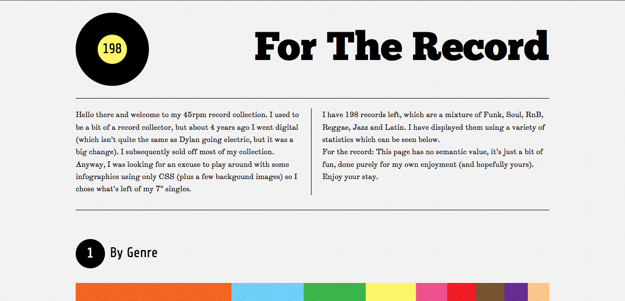
For The Record is a website displaying information about music form different countries and genres etc. It does this through information graphics, and a lot of negative space, this works really well for this topic. Pure information using only different shapes and colours communicates its message well, this is also something I want to do, have a minimal website with only information that is needed, not cluttered with irrelevant stuff.

Source
In order to properly execute minimalism in your design, a focus needs to be established. Being able to present a clear message to your visitors is the core function of a minimal design. This website design focuses on three main disciplines of Ed Nacional, Branding and Identity, Illustration, and Lettering. In each discipline area the mouse icon changes as you scroll over it, which makes you want to click, which then takes you to the next example of 'Illustration' for example, this is minimal and it works really well.

Monday 9 December 2013

Greetings Cards Research

Hallmark Cards;
Source

At Hallmark, we strive to make our products as relevant to as many people as possible. With one of the world's largest creative staffs – around 625 artists, designers, stylists, writers, editors, web designers, and photographers – and the best researchers in the industry, we provide a year-round greeting card selection of more than 18,000 designs.
For consumers who want Hallmark quality but with customizable options, Hallmark.com offers the ability to create one-of-a-kind greeting cards with personal sentiments, photos and sound clips. Cards can be chosen online and personalized at any time. Hallmark professionally prints the cards, and can even address, stamp and mail them. There's also a free app for iPhone® called Hallmark Go Cards that makes the "perfect" card available anytime, from anywhere.
Hallmark.com also provides a variety of ecards to enable consumers to connect digitally. Some ecards feature popular music, TV and movie clips, and animation. Hallmark Card Studio software provides the tools to create greeting cards on a home printer.
In addition, people can compete to have their creations featured in Hallmark cards through a series of Your Greeting Card competitions at HallmarkContests.com. Contestants submit a cover image and message for a chance to be chosen as a winner and have their creation made into a real Hallmark card.

Moonpig.com;
Source

Moonpig.com is a business based in Guernsey and London which sells personalised greeting cards. The website was launched in July 2000, and in 2007 the company was responsible for 90 percent of the online greeting card market in the United Kingdom, with nearly six million cards shipped.
 According to founder Nick Jenkins, 'Moonpig' was his nickname at school, hence the name of the brand.
Customers who visit the website can choose from a large selection of basic card designs and enter their own text to personalise them. In addition to cards, the company offers customisable spoof magazine covers and invitations, where customers can upload their own photos for printing.
The original launch of Moonpig.com in 2000 coincided with the collapse of the dot-com bubble which meant progress was difficult at first, but Jenkins raised further investment from private investors and venture capital, and the advent of broadband and digital cameras together with news spreading by word-of-mouth meant sales steadily increased, with the first profits being made in 2005. A television advertising campaign began in the United Kingdom in November 2006, and in February 2008 Moonpig.com received more internet traffic than other flower and gift companies in the UK. By Summer 2009, the company had 2.57 million customers and its profit record was seen by The Times as "a typical curve for a successful start-up — a big, £1 million loss establishing it in its first year, negligible losses edging into negligible earnings over the next six years, and thereafter a seven-figure profit".
The company was initially based in Chelsea, but moved to Guernsey in 2006, maintaining a small office in London to deal with marketing and IT software. Along with the other Channel Islands, Guernsey has a VAT exemption on UK-bound goods costing less than £18. The business expanded into the Australian market in 2004, and in late 2009, the business expanded its offering to include a range of flowers and custom mug designs. In spring 2010, Moonpig launched in the United States.
In July 2011, Moonpig was bought by PhotoBox.

My preference;
In my opinion after looking for personalised cards for a friends birthday on moonpig.com, I found that I didn't like any of the cards, I thought that they were all very generic and very samey.
Source
I didn't find one card which I thought was appropriate or good enough for my friend, I personally wouldn't buy a card which I didn't like therefore wouldn't use Moonpig, or Funkypigeon. I prefer homemade cards or screen printed cards, or just really well designed cards, rather than just mass produced ones. As well as homemade cards in shops, there are websites which sell them too, and think that's a good idea, but most of the website I ave found, are very children based for example, Spoonful.com.

Source
This is a website I found which sell handmade cards, and gives people ideas to make their own handmade cards, I think that I will refer to this website a lot if I was making cards, it not only shows you what you can do, but also shows the techniques on how to make them.

When I a designing my website I need to bare in mine my audience, as Hallmark and Funky Pigeon and Moonpig are trying to sell to the masses. Where as my website will be selling bespoke cards for special occasions or just trying to show a loved one how much they mean to you. I want to make my website more elegant and simple, not really buy and covered in adverts.