The Lecture;
Areas for consideration...
-The origins of Graphic Design
-Graphic Design in relation to Fine Art
-Graphic Design in relation to Advertising
-Graphic Design tool of capitalism
-Graphic Design as a political tool
-Graphic Design and postmodernism
-Graphic Design and social consciene
John Everett Millais - Pears Soup - early form of Graphic Design
"Whatever the information transmitted, it must ethically and culturally, reflect its responsibility in society." Josef Muller Brockman
Early Graphic Design is linked to advertising
Charles Rennie Machintosch (1896) poster (sense of Graphic Design)
Koloman Moser (1902) poster (sense of Graphic Design)
Peter Behrens, AEG (1910) (sense of Graphic Design)
Short space of time, Graphic Design being developed 10-15 years
Julius Gipkens, Trophies of the Air War (1917) poster
Wassily Kandinsky (1886-1944) composition VIII (1923)
F.H Stingemore (UK) London Underground map 1931-2
-More realistic- simplified - considered
Oskar Schlemmer (German) Bauhaus logo 1928
-first place Graphic Design considered as a disipline
Important Graphic Designers;
-Herbert Matter - Swiss
-Cassandre - French
Peter Saville, Blue Monday
-lost money on it - more interested in the design of the thing rather than the money
Don't mistake legibility for communication
Publis image limited album sleeve design (1986)
Chumbawamba, pictures of starving children sell records (1986)
Designers republic (1994) pop will eat itself
Mark Farrow - ladies and gentlemen we are floating in space
-most iconic design in the 20th century (limited edition) (1997)
Jonathan Barnbrook, Olympukes
Final thought;
-Graphic Design is a relatively young discipline
-Links between Graphic Design and different discipline
--e.g. Fine Art, Advertising are arguably becoming increasingly blurred
-Although born out of consumerist/capitalist interests, Graphic Design is arguably becoming increasingly concerned with social issues.
Wednesday 24 October 2012
Graphic Design and Modernism
Modern - to modernize is to make something better
Modernity - is industrialization and urbanization
Modernism - is response to condition of the modern
Modernism in Graphic Design;
Rejection of ornament (Adolf loos (1908) ornament and crime)
Form follows function (Louis Sullivan (1896) 'The tall office building artistically considered')
-How you make something look, comes second to the product actually working
Cheret (1884) Toulouse-Lautrec (1891) Marriett (1905)-type as image 'Parole in liberta' - the futurists(type) fortunato pepero (1927) bolted book
truth to materiality, celebrate materials
Appollinaire (1918) - concrete poetry
Jan and schichold (1927)
-no font except Grotesk fit for the modern age
-Fraktur-black letters, looks like handwriting-German greatness
-Tschischold critique this
-It is nationalistic historic e.t.c
International typographic style (swiss style)
-Switzerland post WW1
-Grid
-Aksidenx Grotesk/Helvetica
-Flush left, ragged right text
-Abandoning of drawn illustration in favor of photography
--No decoration --Internationalist --Simple --Function over form --Stripped down --Two/three colours
-Joseph Miller Brockman
Boyne and Rattansi (1990) Postmodernism and society
-Aesthetic self-reflectiveness
-Montage - splicing together two different radicle things
-Paradox, ambiguity and uncertainty
-Loss of the intergrated individual subject
-Optimism - design could u-night everyone
Optimism and Utopinism;
Universal - design at bauhaus - Herbert Bayer
-make text with machines -new technological text -why embrace the limitations of the past
Conclusion;
-No essence of modernist art and design that is shared by all - just 'family resemblance'
- Modernism moves away from an illusionistic 'realistic' way of deplicting the world and instead relies on signs and symbols


Sunday 21 October 2012
Postmodernism
The Lecture;
Postmodernism-term applied to a wide range of cultural analysis and production since the early 1970's
Modernism is roughly from 1860-1960
Postmodernism is 1960-today
Modernism
-Initially brought out of optimism and technologies to improve peoples lives
-Ends up doctrinaire, almost blind obedience to rules, all above
Postmodernism
-Reaction to the rules
-Starts as a critique of international style
-Only rule is that there are no rules
-Celebrates what might otherwise be termed kitsch
If modernism equates with;
-Simplified aethetic
-Utopian ideals
-Truth to materials
-Form follows function
Postmodernism involves;
-Complexity
-Chaos
-Bricolage
-Parody, pastiche, irony
Postmodernism
Postmodernism has an attitude of questioning conventions
Postmodernism aesthetic = multipicity of styles and appoaches
Theme of 'double coding' borrowing or 'quoting' from a number of historical styles
Knowing juxtapositions, or 'postmodernism irony'
Questioning and limitations
Space for marginalized discourse;
-women, sexual diversity and multiculturalism
"I like elements which are hybrid rather than pure"
Las Vegas - ultimate postmodernism city - done in a tacky way - very kitsch
David Carson, Ray Gun, double page spread
-Functionalism - legibility
-Look and lifestyle - rather than something you would actually read
-Don't mistake legibility for communication
Barbara Kruger, I shop therefore I am, 1987
-Median of Graphic Design transferring to fine art
Summary;
-Postmodernism attitude of question conventions (especially modernism)
-Postmodernism aesthetic = multipicity of styles and approaches
-Shift in thought and theory
The Seminar;
Friday 19 October 2012
Alphabet Adam
In this brief we had a partner chosen from the randomiser and I got
Adam Garbutt. We then had to fill in questionnaires about our selves,
then we found that we had to create a typeface and 6 glyphs showing
characteristics of our partner. This is when we thought that the
questions we had previously answered were not sufficient amount of
information about the other person to produce a typeface on them.
Therefore we collected our own information afterwards.
The questionnaire;
 Our own information;
First we wrote out an alphabet in upper and lower case for each other, so that we could see each others hand writing, I also asked Adam to write out his name, as he joins up his writing.

Quiet person when not drinking
Easy to talk to
Perfectionist
Mostly happy (when not hungry)
Deep sleeper
Printing type
Horder(polythene bags, train tickets, pen nibs)
Likes collecting things
Hairy
Leather shoes
The rest of development(american show)
Back to the future
Quentin Tarentino
Matrix
Custard-Lollipops-Chewing gum(to stop from biting nails)
Near Middelsborough-Skelton
2 brothers, 25, 27
Don't go on nights out a lot
Dog Person
Arial - Arial Rounded - Gill Sans
Lowercase
Sag and Walsh
Fruit
Walking
After finding this information I started to research Adam's likes and dislikes, looking at his blog, even at his facebook, to find out more about him.
http://sagmeister.com/work/featured#/node/191
http://sagmeister.com/work/featured#/node/188
 http://www.behance.net/gallery/Ribbon-Alphabet/248759
 http://www.zootpatrol.com/index.php/2010/10/10-predictions-back-to-the-future-ii-got-right/
These are some of the designers and films that Adam is interested in so that I can understand things and elements I can include to make my type portray Adam's interest. I also looked in the book 'Hand Job' to find other typefaces that I thought would work well, also 'Hand Job' is one of Adam's favorite books.
These would both work really well to show charactoristics of Adam, as their favourite designer or book or design itself says a lot about them.
The questionnaire;

First we wrote out an alphabet in upper and lower case for each other, so that we could see each others hand writing, I also asked Adam to write out his name, as he joins up his writing.

Quiet person when not drinking
Easy to talk to
Perfectionist
Mostly happy (when not hungry)
Deep sleeper
Printing type
Horder(polythene bags, train tickets, pen nibs)
Likes collecting things
Hairy
Leather shoes
The rest of development(american show)
Back to the future
Quentin Tarentino
Matrix
Custard-Lollipops-Chewing gum(to stop from biting nails)
Near Middelsborough-Skelton
2 brothers, 25, 27
Don't go on nights out a lot
Dog Person
Arial - Arial Rounded - Gill Sans
Lowercase
Sag and Walsh
Fruit
Walking
After finding this information I started to research Adam's likes and dislikes, looking at his blog, even at his facebook, to find out more about him.
 |
| Sag and Walsh |
 |
| Sag and Walsh |


These are some of the designers and films that Adam is interested in so that I can understand things and elements I can include to make my type portray Adam's interest. I also looked in the book 'Hand Job' to find other typefaces that I thought would work well, also 'Hand Job' is one of Adam's favorite books.
 |
| Typeface by A.J.Purdy Hand Job |
 |
| Three typefaces, 2005, pen on paper, Hand Job |
Modernism
The Lecture;
John Ruskin 1819-1900; modern painters
Modern(of the moment) - not just the latest, known as the best
To make something more modern was to improve
15th July 1972 3:32pm modernism dies according to Charles Jencks (the demolition of the pruitt - Igoe development, st Louis)
Paris 1900 - turn of the century - most modern city at the time
-Troltair Roullant (electric moving walkway) urbanization
-Rapid advances in technology - industrialisation
-world time was standardized - because of the railway system - rapidly accelerates and changes
-new way to spend leisure time, shopping etc.
Hyde park picture house emerged in this time
Process of rationality and reason
-Enlightenment=period in late 18th century when scientific/philosophical thinking made leaps and bounds
The city - a site of moderism
Eiffel tower - sign of modernism - industrial palace
First attempt to capture this experience was a poet
Haussmanisation
Paris in 1850s = a new Paris
Old Paris architecture of narrow streets and run down housing is ripped out Haussman (city architect) redesign Paris
Large boulevards in favor of narrow streets - this made the streets easier to police = a form of social control
Also the 'dangerous' elements of W.C. to be moved outside the city
First phycology labs - 1893
-Come from thinking moderism will send people crazy
Alienation in the modern world (class divition)
Germany - kaiserpanorama - pay money to look through a hole to see slides or clips - investing into the modern
-rather than experiencing the world through a device rather than directly experiencing it - more mediated
Max Nordau Degenation 1892 (an anti modernist) wrote about his worries on the modern world - predicts
-constantly called on the telephone
-railway - or caridge machines
If we start to think about subjective experience...(the experience of the individual in the modern world) we start to come close to understanding modern art and the experience of modernity
Modernism;
Modernism emerges out of the subjective responses of artists/designers to modernity
Paint a lot because of the threat of photography and new media, way of recording documents, new media is more accurate - painting has to reinvent views and angles to looking at the worlds relationship between science, new technology, investigation
Modernism in Design;
-Anti-historicism - look forwards
-Truth to materials - new materials and technologies
-Form follows function - things should work and be practicle and minimal
-Technologies - don't hide the fact, using new technologies
-Internationalism - everyone can understand it
Anti-historcism - no need to look backward to older styles 'ornament is crime' - Adolf loos (1908)
Truth to materials, simple geometric forms appropriate to the material being used
Forms a function
The Bauhaus - famous for producing the most famous modernist art and designers - modernist educators - modernist aethetic to the building - modern windows - box building to rationalize space - made with concrete - modern material - futura typeface, sans font, introduced in modernism
Internationalism;
A language of design that could be recognised and understood on an international basis
Example of Herbert Bayer's sans serif typeface, he also argued for all text to be lower case (ditch capitals)
Times New Roman - Stanley Morrison 1932 - British imperial greatness
Germany used Fraktur font on proporganda gothic Germanic supiriority
Importance of...
...a vocabulary of style
...art and design education
...idea of form follows function
Technology/ New materials;
-concrete
-new tech of steel
-plastics
-aluminium
-reinforced glass
The term modern is not aneutral term - it suggests novelty and improvement
"Modernity" (1750-1960) - social and cultural experience
"Modernism" - the range of ideas and styles that spring from modinerts
Wednesday 10 October 2012
Context task 2
For our first part of task 2 we were told to get into groups, look through the Leeds College of Art 2012-13 prospectus, and make notes about what we thought about it, the things we liked and disliked, and what we thought worked or didn't work.
Does it work? Is it successful?
This is what I will be looking for;
The choice and organization of font(s) and overall aethetic.
The purpose and meaning of the publication.
The target/potential audience of the publication.
Any social or political context relevant to the production of the publication.
Whether the design solution ultimately.
Notes on the publication;
Front page looks like a rubbish power point with a childlike font (Biff and Chip) Its patronising and attracting the wrong people to the college.
Bad type on the contents and unnecessary text.
Over whelming about of text.
Like the subheading font, its more appropriate, but it doesn’t go with the rest of the type.
Not got a good balance of type to image.
Doesn’t say Leeds College of Art anywhere on the front, it says it on the back, although its not right aligned, left aligned or centered, its just randomly been placed on the page.
Different paper in the book itself, swaps from matt to satin randomly.
Trying to appeal to visual people and attract them to come to LCA, but the prospectus isn't very visual.
On page 134, you cant read the text on the image.
The layout of the images are very random and visually unsettling.
Headings don’t stand out.
Graphic Design pages don’t show Graphic Design.
Here are my 5 constructive criticisms of the prospectus;
There is no need to change the paper in the prospectus, it should all be the same keep it consistent, otherwise it seems unprofessional, and makes the satin paper sections look superior to the matt.
The Leeds College of Art logo on the back of the prospectus would look better if it was left aligned or Centered, not dropped in the middle.
The power point look is not good for the prospectus, so the front page may need to change its layout.
The font of the text in the Prospectus sometimes doesn't make sense, it doesn’t look right, the font needs greater consideration, as it is attracting the wrong people at the moment.
The Headings don’t stand out very much, therefore people get lost and don’t know where certain things can be found, making it bigger or on the left side rather than right may also make it easier to locate.
The second part of task 2 was to analyse two images, find what elements are similar and things that are not. We are working in a group of 4 people so that we could talk to each other and tell them why we thought what we thought.
The Uncle Same Range (1876) Advertising Image by Schumacher and Ettlinger, New York

Poster by Savile Lumley (1915)

After collecting this information from our group we listened to other people's opinions on the images and added their thoughts to our list so that we could gather as much information as possible so that we could write a short essay about how these images are similar and how they are dissimilar. Here it is;
The two Images, The Unlce Same Range and The Poster by Savile Lumley are two very different images, but with similar aspects to them. Uncle Sam’s Range is and American advert about selling ovens, it is very in your face and patriotic, dedicated to America and the way they think poeple want to live. Where as the poster by Savile Lumley is a classic British scene, and its a subtle way of guilting men into going to world war one.
These images are similar as they are both very patriotic and are also both aimed at middle class men. Uncle Sam's Range allows the audience to see what their life would be like if they had this oven, as in the image it shows that men who have this oven are very wealthy and therefore can afford good products, which makes middle class men want to buy it so they can aspire to be like the man in the image. With the British propaganda poster it is a lot more subtle in the message it is giving. It was created mid world war one, and was designed to think into the future after the war, and shows what middle class men could have, and it shows a good life. They designed this Poster expecting that we would win and people would write books about it, and remember it for ever. The message in the image shows that if you don’t contribute to the war you don’t deserve this great life you lead, this is why its aimed at middle class men, because they have a good life before the war anyway, but makes you feel guilty for not being involved. This is another reason why the two images are very similar as they both have big igos, the British just presuming that we will win the war, whilst the Americans presume that everyone want to be like them as they are ‘feeding the world in the aid of The Uncle Sam Range’ by allowing others to buy their product.
The type in the British poster is aimed towards the audience rather than focusing on the child asking her dad, this is clear as the dad in the image is looking to the audience as if waiting for an answer. The type is clear and easy to read, it has a good layout and is very clear what the message is and what the poster is about. Where as the main type in The Uncle Sam’s Range image is more in the style of a saloon bar, its very western and in gold, the smaller Type isn’t very legible and is very hard to read. This is where the images differ as I personally didn’t understand that The Uncle Sam’s Range image and that it was trying to sell ovens. Where as the British Propaganda image came to me straight away, it a lot less cluttered and busy than the other image, which I think works better as it is more clear. These images have very similar aspects, target audiences and concepts but also differ in many ways, such as the approach to getting the message across.
Does it work? Is it successful?
This is what I will be looking for;
The choice and organization of font(s) and overall aethetic.
The purpose and meaning of the publication.
The target/potential audience of the publication.
Any social or political context relevant to the production of the publication.
Whether the design solution ultimately.
Notes on the publication;
Front page looks like a rubbish power point with a childlike font (Biff and Chip) Its patronising and attracting the wrong people to the college.
Bad type on the contents and unnecessary text.
Over whelming about of text.
Like the subheading font, its more appropriate, but it doesn’t go with the rest of the type.
Not got a good balance of type to image.
Doesn’t say Leeds College of Art anywhere on the front, it says it on the back, although its not right aligned, left aligned or centered, its just randomly been placed on the page.
Different paper in the book itself, swaps from matt to satin randomly.
Trying to appeal to visual people and attract them to come to LCA, but the prospectus isn't very visual.
On page 134, you cant read the text on the image.
The layout of the images are very random and visually unsettling.
Headings don’t stand out.
Graphic Design pages don’t show Graphic Design.
Here are my 5 constructive criticisms of the prospectus;
There is no need to change the paper in the prospectus, it should all be the same keep it consistent, otherwise it seems unprofessional, and makes the satin paper sections look superior to the matt.
The Leeds College of Art logo on the back of the prospectus would look better if it was left aligned or Centered, not dropped in the middle.
The power point look is not good for the prospectus, so the front page may need to change its layout.
The font of the text in the Prospectus sometimes doesn't make sense, it doesn’t look right, the font needs greater consideration, as it is attracting the wrong people at the moment.
The Headings don’t stand out very much, therefore people get lost and don’t know where certain things can be found, making it bigger or on the left side rather than right may also make it easier to locate.
The second part of task 2 was to analyse two images, find what elements are similar and things that are not. We are working in a group of 4 people so that we could talk to each other and tell them why we thought what we thought.
The Uncle Same Range (1876) Advertising Image by Schumacher and Ettlinger, New York

- Very patriotic, red, white, blue, stripes, stars, similar to flag
- Bald eagle on shoulder of man in image
- Black slave doing the cooking, back then showed wealth
- Advert for ovens, selling ovens but not on how good the oven is, but by who owns these ovens-the tactic of advertising
- Wealthy people so best ovens
- July 4th 1776- America got their independence and shows 100 years of independence, shows how far they’ve got
- Showing American greatness, willing to host a dinner party for the rest of the world, showing they are better than others, being slightly racist with the food choices for other countries, and making fun of them
- Only been independent for 100 years but showing how superior they are
- Saloon bar font-looks like a Western style and its gold
- Caricature of an American dream
- Aimed towards American men aspiring to be the man in image
- Middle class men, if he has it, you want it
Poster by Savile Lumley (1915)

- Propaganda-to make people feel guilty if their not in the war
- Patriotic and British
- Picture pefect, exactly where each memeber of the family should be
- Man looking towards the audience, all about the dad
- Wealthy family, dad in a suit, children in nice clothes
- Very subtle message, British
- Shows family values
- Everyone has serious faces
- The font is clear and readable, asking question to the audience
- Poster made mid World War one, and shows looking forward to after we have won the war
- What would you say to your children about the war if you knew you did nothing to contribute
- Nature of war; it was expected that the men were to go to war
- Expected that we would win, and poeple will write about it, and you have won this great life, but meaningless if you did not contribute
- Font/type-targets the audience, asks question to us not the dad, as he is looking at the audience; and is also italic so looks like speech
- ‘Great war’ -everyone will remember it forever
- Aimed towards middle class - noone had to sign up for the war, but working class would for the money, therefore guilt middle class into helping and promote the war
After collecting this information from our group we listened to other people's opinions on the images and added their thoughts to our list so that we could gather as much information as possible so that we could write a short essay about how these images are similar and how they are dissimilar. Here it is;
The two Images, The Unlce Same Range and The Poster by Savile Lumley are two very different images, but with similar aspects to them. Uncle Sam’s Range is and American advert about selling ovens, it is very in your face and patriotic, dedicated to America and the way they think poeple want to live. Where as the poster by Savile Lumley is a classic British scene, and its a subtle way of guilting men into going to world war one.
These images are similar as they are both very patriotic and are also both aimed at middle class men. Uncle Sam's Range allows the audience to see what their life would be like if they had this oven, as in the image it shows that men who have this oven are very wealthy and therefore can afford good products, which makes middle class men want to buy it so they can aspire to be like the man in the image. With the British propaganda poster it is a lot more subtle in the message it is giving. It was created mid world war one, and was designed to think into the future after the war, and shows what middle class men could have, and it shows a good life. They designed this Poster expecting that we would win and people would write books about it, and remember it for ever. The message in the image shows that if you don’t contribute to the war you don’t deserve this great life you lead, this is why its aimed at middle class men, because they have a good life before the war anyway, but makes you feel guilty for not being involved. This is another reason why the two images are very similar as they both have big igos, the British just presuming that we will win the war, whilst the Americans presume that everyone want to be like them as they are ‘feeding the world in the aid of The Uncle Sam Range’ by allowing others to buy their product.
The type in the British poster is aimed towards the audience rather than focusing on the child asking her dad, this is clear as the dad in the image is looking to the audience as if waiting for an answer. The type is clear and easy to read, it has a good layout and is very clear what the message is and what the poster is about. Where as the main type in The Uncle Sam’s Range image is more in the style of a saloon bar, its very western and in gold, the smaller Type isn’t very legible and is very hard to read. This is where the images differ as I personally didn’t understand that The Uncle Sam’s Range image and that it was trying to sell ovens. Where as the British Propaganda image came to me straight away, it a lot less cluttered and busy than the other image, which I think works better as it is more clear. These images have very similar aspects, target audiences and concepts but also differ in many ways, such as the approach to getting the message across.
Love/Hate
Our first task for Design Context was to blog on piece of design which I love, and one piece of design which I hate.
Love; Noma Bar Negative space

http://www.pixelelement.com/brilliant-negative-space-illustrations-by-noma-bar/
I love this piece of design and the designer, especially his book called Negative Space. I love how simple to design is but has hidden messages through it using the negative space, as it shows other images, I think its really cleaver and admire it very much.
Hate; Mama Cheesies website
 http://mamascheesies.com/
I hate this web design, the text is really hard to read and it is not welcoming. The page feels really busy even though there is hardly any information on it. The layout is all centered apart from the images of the product, and it just doesn't look professional and wouldn't make me want to buy anything from it.
Love; Noma Bar Negative space
http://www.pixelelement.com/brilliant-negative-space-illustrations-by-noma-bar/
I love this piece of design and the designer, especially his book called Negative Space. I love how simple to design is but has hidden messages through it using the negative space, as it shows other images, I think its really cleaver and admire it very much.
Hate; Mama Cheesies website

I hate this web design, the text is really hard to read and it is not welcoming. The page feels really busy even though there is hardly any information on it. The layout is all centered apart from the images of the product, and it just doesn't look professional and wouldn't make me want to buy anything from it.
Pop
With this brief, we first started by using the letter forms which we collected over the summer for the summer brief. We organized all of our letters as a group into ten categories which we had previously chosen as what we know would separate letter forms from one another. Our categories were;
There were many letters as there were eight people in my group, each with 30 examples of each letter form, therefore we each did our own individual section to make it easier, so its not as cluttered.


We then had to select a word from the randomiser, and I got the word ‘pop’, so started looking into the definition of the word, and all the possibilities I could use to demonstrate the word ‘pop’ in a letter form.
The definition of ‘pop’ is;
abbr.
v.intr.
adv.
n.
I also looked at pop art, and the different artist and the aspects of each piece to try and portray pop in my letter forms. First I looked at Roy Lichtenstein’s illustrations and considered that it consists of a lot block colors and repeat patterns, for example on the women's face, repeating dots.


http://fortyfoursunsets44.blogspot.co.uk/2012/04/roy-lichtenstein-retrospecitve.html
I then looked at Andy Warhol and also found that there was a lot of repeating patterns in different color. Also there is a lot of colors which are very vibrant.

http://patriciasainzderozas.blogspot.co.uk/2010/10/pop-art-andy-warhol-roy-lichtenstein.html
 http://thehappinesschallenge.tumblr.com/post/32655614603/andy-warhol
Next I looked at different things like with the pop in it, and the sound of popping like;
 http://alwayscurious.crownbc.com/?p=814

http://www.crestock.com/image/1970371-Bubbles.aspx
 http://www.guardian.co.uk/artanddesign/artblog/2007/oct/04/poptastic
 http://scriptsforschools.com/catalog/ch-choral-reading-scripts-older-readers/ch-37-pop-until-we-drop-a-popcorn-story/
 http://infocommclub.vs.moe.edu.sg/competition11/newdc/index.php
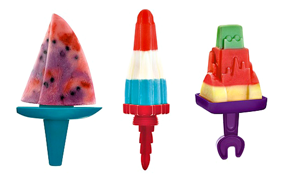
 http://www.incrediblethings.com/home/ice-pops-just-got-more-fun/
I also looked in Typography books such as 'Hand Job' and 'New Illustration with Type' to find type faces which show different things such as pop.
Typography even without the word pop can show pop, therefore something like this would work for my letter forms, as the first thing that came to mind when you see these examples of type you think of pop.
- Serif
- Sans-serif
- Objects in the form of letters
- Uppercase
- Lowercase
- Hand rendered
- Digital
- Italic
- Bold
- Calligraphy
There were many letters as there were eight people in my group, each with 30 examples of each letter form, therefore we each did our own individual section to make it easier, so its not as cluttered.
We then had to select a word from the randomiser, and I got the word ‘pop’, so started looking into the definition of the word, and all the possibilities I could use to demonstrate the word ‘pop’ in a letter form.
The definition of ‘pop’ is;
abbr.
- point of purchase
- proof of purchase
v.intr.
- To make a short, sharp, explosive sound.
- To burst open with a short, sharp, explosive sound.
- To move quickly or unexpectedly; appear abruptly: At last the cottage popped into view.
- To open wide suddenly: The child's eyes popped with astonishment.
- Baseball To hit a short high fly ball, especially one that can be caught by an infielder: popped out to shortstop.
- To shoot a firearm, such as a pistol.
- To release (a clutch) suddenly.
adv.
- With a popping sound.
- Abruptly or unexpectedly.
n.
- A sudden sharp, explosive sound.
- A shot with a firearm.
- Chiefly Midwestern U.S. See soft drink. See Regional Note at tonic.
- Baseball A pop fly.
I also looked at pop art, and the different artist and the aspects of each piece to try and portray pop in my letter forms. First I looked at Roy Lichtenstein’s illustrations and considered that it consists of a lot block colors and repeat patterns, for example on the women's face, repeating dots.


http://fortyfoursunsets44.blogspot.co.uk/2012/04/roy-lichtenstein-retrospecitve.html
I then looked at Andy Warhol and also found that there was a lot of repeating patterns in different color. Also there is a lot of colors which are very vibrant.
http://patriciasainzderozas.blogspot.co.uk/2010/10/pop-art-andy-warhol-roy-lichtenstein.html

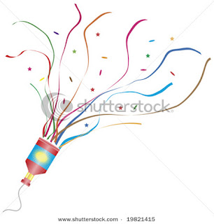
Next I looked at different things like with the pop in it, and the sound of popping like;
- Popcorn
- Ice-pops
- Fizzy pop
- Bubble wrap
- Party poppers
- Balloons popping


http://www.crestock.com/image/1970371-Bubbles.aspx


I also looked in Typography books such as 'Hand Job' and 'New Illustration with Type' to find type faces which show different things such as pop.
 |
| Sound and Vision, 2009. New Illustration and Type |
 | ||
| Big Mouth Project, 2009, New Illustration and Type |
Subscribe to:
Posts (Atom)